
Investigating ATAR
Whose ATAR is it anyway?

So, this was meant to be a relatively simple follow-up to my post on ATAR and Victorian Aggregate Scores looking at how things differ in other states and territories to Victoria. You know, it’s the Australian Tertiary Admission Rank. Making comparisons across the country is quite literally what its designed for, right? Then things started to get weird as I dug into the publicly available data.
ATAR and Victorian Aggregate Scores

While we’re on the topic of study scores and scaling, it would be good to check out how they’re contributing to students’ ATAR (Australian Tertiary Admission Rank). For the non-Australian’s, it a rank students get based on their Year 12 results that they use to apply to get into university courses. You can read more about it
What’s the TEA? Comparing aggregates
Let’s start with what I had planned. What are the minimum aggregate scores that students need to place in different ATAR bands? We’ll take a small sample of bands for simplicity’s sake. Let’s say:
99.95 for the highest possible ATAR
99.00 for the top 1% of students
90.00 for the top 10% of students
50.00 for the top 50% of students
30.00 for the cut-off before being classified in the <30 group.
Typical Australia, every state and territory is releasing their own spin of data for Year 12 results and tertiary admission. We’ve got aggregates, we’ve got Tertiary Entrance (TE) scores, and we’ve got Tertiary Entrance Aggregates (TEA). While I found most of the conversions, I haven’t been able to locate the data for Queensland and the ACT.1
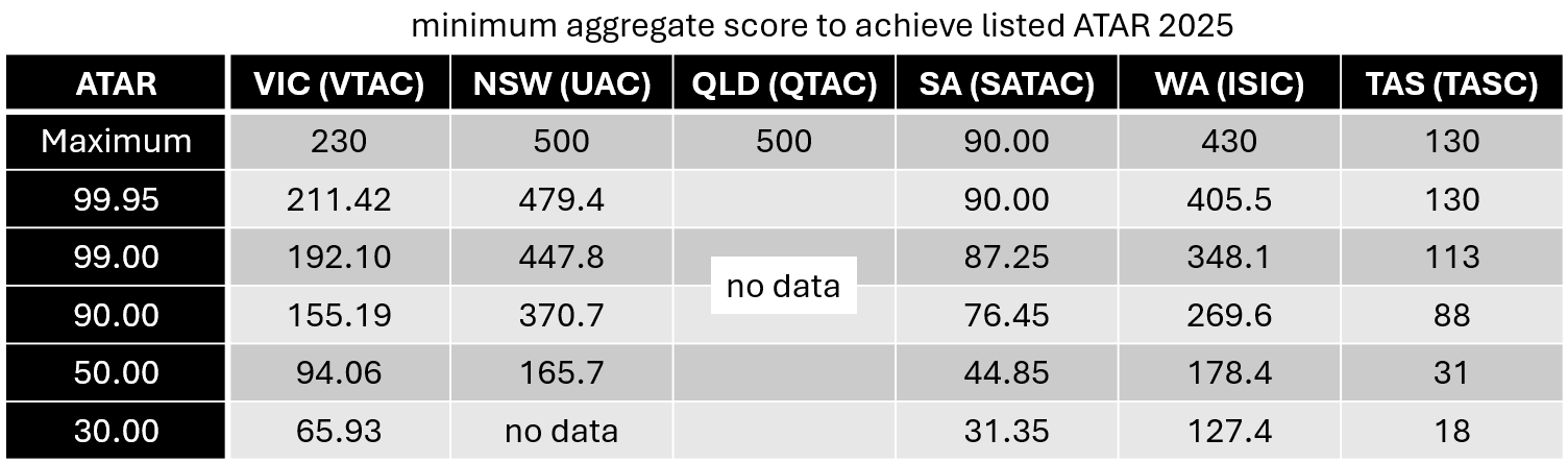
Loving the consistency, guys. Can’t have a universal aggregate score, can we?2
Let’s make those percentages so we somewhat compare these a bit better. I mean, the aggregate to ATAR conversion should all be on the same distribution, right?
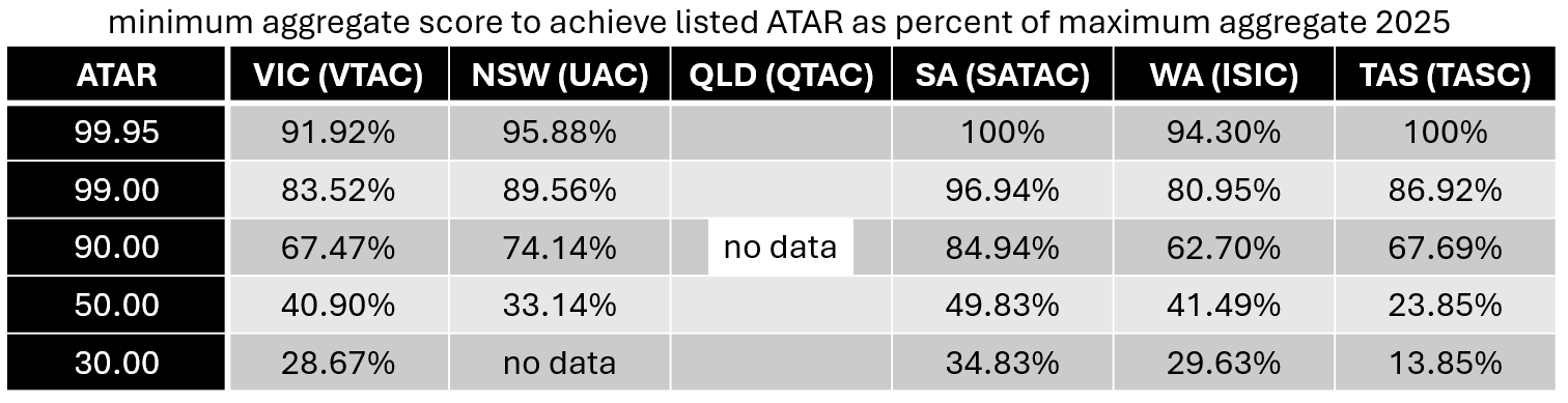
…or not. South Australians interestingly enough needing the highest aggregate scores and Tasmanians needing the lowest at the bottom end. For a number of states, you don’t need a “perfect” score to place in the highest ATAR band of 99.95 marking the difference between theoretical maximum scores and practical maximum scores.
Cumulative percentages of students
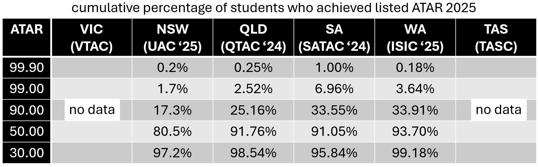
While browsing the data for the other states, I noticed that they were reporting on the cumulative percentage of students who achieved given ATAR bands.
I thought, “that’s strange, why do they feel the need to report that? That should just be the opposite of the percentile, right?”
Um.
That’s…
That’s not how percentiles are meant to work, right?
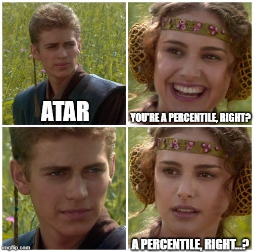
My head swirled and the questions came fast.
Why are nearly all students ranked above 30.00?
Where’s the 30% below an ATAR band of 30.00?
Why is there 2.5% of QLD students, 3.6% of WA students, and nearly 7% of SA students in the top 1% with ATAR bands of 99.00 or higher?
How is there only 20% of students in NSW and less than 10% of students in QLD, SA, and WA in the bottom 50% of bands?
Queensland only has a 50% participation rate in ATAR, why is it not just those at the bottom?
Is the same happening in Victoria and they’re just not reporting on it?3
What is going on?! Have I stumbled into a publicly accessible conspiracy theory? Are we all being hoodwinked in broad daylight?

Let’s do the quick check to make sure that we haven’t been misinterpreting ATAR this whole time.
VTAC: “A student with an ATAR of 75.00 has achieved VCE results above 75 per cent of the Year 12 age group.”4
UAC: “For example, an ATAR of 85.00 in NSW or the ACT is equivalent to an ATAR of 85.00 in other states.”5
QTAC: “if the Queensland Year 12 population is approximately 60,000 students then approximately 30 students will be placed in each ATAR band….The top 30 students are assigned ATAR 99.95, the next 30 students are assigned 99.90, and so on.”6
SATAC: “So, if you achieve an ATAR of 95.00 it shows that you performed as well as, or better than, 95% of the population.”7
ISIC: “If you have an ATAR of 70.00, for example, it indicates that you’ve achieved as well as or better than 70% of the Year 12 school leaver age population in the state.”8
TASC: “For example, an ATAR of 80.00 indicates that you have an overall rating equal to, or better than, 80% of the other ATAR recipients in Tasmania.”9
So, everyone’s singing from the same hymn sheet that it’s a percentile. So, like Alice, down the rabbit hole we must go to find out what’s going on.
I wonder if I shall fall right through the earth!
Typical Australia, every state and territory was doing its own thing for tertiary admission. Most students would be going to the universities (or singular university in some cases) in their home state or territory anyway, so as long as they had a way to accommodate interstate (and international) students, then all was good.
Typical Australia, we decided that maybe we should unify a bit. Y’know, Australian Curriculum and all. So,
In 2008 a decision was taken by the Australasian Conference of Tertiary Admission Centres (ACTAC) to adopt a common name, the Australian Tertiary Admission Rank (ATAR), which would replace the existing names of the different selection indices used by states and territories.10
Ok. Makes sense.
The name change was not to suggest that there was a common method for calculating the selection indices in the different jurisdictions, but to emphasise that students’ ranks from different jurisdictions were reported on a common scale.11
Oh, so they’re definitely still doing their own thing and somehow ending up on the same scale. That’s not suspicious. We’ll table that for now.
Let’s see how ATAR is actually being calculated.
First, I found this paper from QTAC. Mentions a lot of the same things that VTAC does for Victoria: process for determining scaling, getting an aggregate, ranking students, iterative process, but with a lot more mathematical jargon and notation.
Section 5 ATAR allocation catches my eye.
As each jurisdiction uses different eligibility rules and subject scaling methods, Queensland’s scaled scores and TEAs cannot be compared directly to those of other jurisdictions. The ATAR however, is designed to be an Australian standard rank for tertiary admissions, and ATAR bands form a basis of comparison of overall student achievement across different states. In order to achieve this, ATARs are calculated using the entire potential Year 12 population as a base (see 5.1).12
“Entire potential Year 12 population”?
What’s wrong with the actual Year 12 population?
In terms of allocation, this means distributing the appropriate number of students in each band, including those who did not qualify for an ATAR, and students who were not captured in the Year 12 data. But rather than expanding the number of students at a constant rate across the ATAR bands, the number of places to be allocated are reshaped through a model using the assumption that “the higher the band, the higher the probability that a student is ATAR eligible” (see 5.2).
So, you’re telling me that students put in all this work to get an ATAR only to be ranked against those who aren’t in the system? We’re not just placing those who didn’t qualify at the bottom, but there’s a function being used to reshape the distribution?
While TEAs or students’ overall ability scores are not directly comparable across different states, each jurisdiction’s distribution of their “students’ ability” is assumed to be the same. Under this construct, the top 5% of students in Queensland, for example, are considered equally able to the top 5% students in any other jurisdiction. This assumption makes it possible to compare ATARs from different states, provided they use the Year 12s as their base population to allocate students into ATAR bands.
For everyone’s sake (including my own), I will leave the debate on whether corresponding rankings across states actually match equivalent students who may be learning and being assessed on similar or different content in similar subjects with similar or different types and difficulties of assessments. But it does motivate an Australian Curriculum for Years 11–12 that all states follow closely (not loosely) and even an Australian assessment system so that we can make those direct comparisons to rank students across the country on the same scale.
Back to the paper. QTAC goes on to describe what they’re actually doing.
The participation model provides an estimate of the achievement of the senior student population within the state-wide population. In other words, it estimates the achievement of students at school compared to the overall population, including those not at school, and ranks them within this population.
…
The participation model used in Queensland is the model introduced by Harrison and Hyndman (2015) based on a one-parameter family of cubic splines (see 5.2.2). As the name suggests, the model is shaped by only one parameter (the participation rate), which defines the curve to be used.
This is also the model currently used by all other jurisdictions in Australia. The participation rate is calculated annually using a standard procedure (see 5.2.1).
Here’s Harrison and Hyndman (2015) for your reference, given that all the states and territories are using it. But QTAC do go on to explain the model.
The Overall Participation Rate (𝑂𝑃𝑅) is defined in each jurisdiction as the ratio between the total number of ATAR eligible candidates and the total weighted population
…
The main assumption is that the probability that a student is ATAR eligible increases with the student’s ability. Therefore, the model reserves more high-ATAR places to eligible students, while reserving low-ATAR places mostly to non-eligible students. The participation curve is defined as:
where x is the proportion ranking of a student within the ATAR eligible population.13
…
Overall, the curves are continuous and monotonically increasing, and the area under each of them is equal to the participation rate
Practically, this means that all places at an ATAR band of 99.95 will be reserved for ATAR eligible students, and all places at an ATAR band of 0 will be reserved entirely for ineligible students, while leaving a number of places available to a mix of eligible and ineligible students in all other bands.
Again, we’re not just putting the ineligible students at the bottom or, I don’t know, not on the scale? Are we not just ranking students with their peers who are also being ranked?
So, where do we go from here?
I have to put some faith in the Australasian Conference of Tertiary Admission Centres (ACTAC) and Harrison and Hynman. I have to hope they’ve gone through all the statistical analysis and reasoning (that is, frankly, a bit beyond me) to justify this approach over a straight ranking system post-scaling. That this means that ATAR does appropriately rank students fairly.
I’m frankly nervous posting this. I know there are regular calls to scrap the ATAR system, and that this could easily be a catalyst for another wave of suggestions for alternative systems that—given the current generative AI state that we’re in—feels wildly more inappropriate.14
Maybe I’m overthinking it and the majority of people already know this is how it works, but my gut tells me otherwise.
What I do want teachers, students, and parents to get out of this would be this:
the ATAR is definitely a rank, but you’re also technically being ranked against students that are not going for ATAR, which feels counter intuitive.
if you are going for an ATAR, you may be more likely than you think to be placed in a required ATAR band or higher and very unlikely to end up with a <30.
despite being an Australian rank, your ATAR band is determined using comparisons within your state alone on the assumption that state-based results are equivalent after scaling.
this is not a call to scrap the ATAR system, but to get a better understanding of it out in the wild.
And for the tertiary admission centres if you get eyes on this:
clarify how you are actually calculating ATAR without brushing the non-ATAR students’ part under the rug.
and for VTAC and TASC specifically: release your cumulative percentages for ATAR bands for some accountability like your interstate counterparts!
Did you know this is how ATAR worked or has this revealed some of the black box to you? Let me know in the comments below.
For 2025 or any year, only that the maximum is 500 for QLD. If you know it exists and can point me there, I’ll update the post. I did find a 2013 document for the ACT, so I assume there are others. I could also use some confirmation that 130 is the highest TE score for Tasmania.
Let alone acronym.
Or maybe they are and they’re hiding it somewhere, despite otherwise a lot of transparency in reporting here.
CALCULATING THE ATAR IN QUEENSLAND, bold emphasis added
I’ve cleaned up their TeX for clarity and substituted α = 1.5 − 2OPR. I’ve also thrown together an interactive graph of this function here.
You can work out whether that sentence was AI generated or that I like to use em-dashes.